This post is part of a series of posts I will write as I reflect on the iHeartFaces Photography Conference for women which I attended the first weekend of October, 2013. To see the all posts, click here.
On Sunday, we all went on a photo walk. Here we are waiting for our groups to gather!

There were several “stations” on the property. Each professional photographer gave us tips and we shot real and quick sessions with their tips. Here are my results.
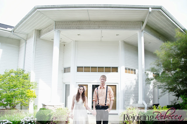
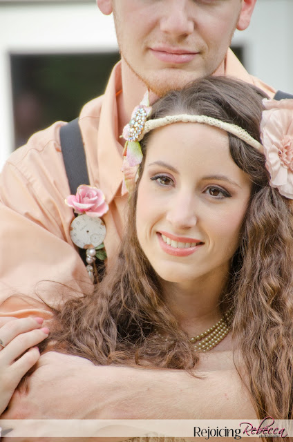
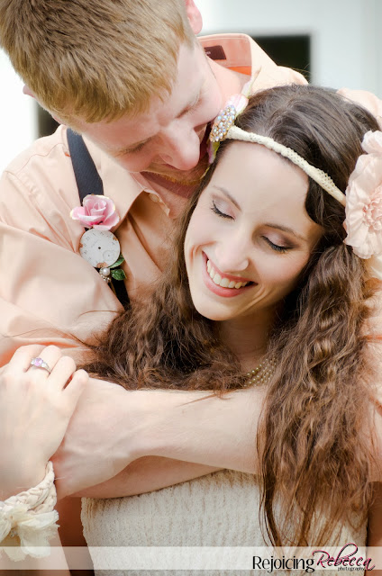
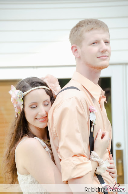
A Stylized Couple’s Session


Cute Strawberry Blonde Sisters


Three Elementary Kids


A Family in a Field


Two Teen Girls


The photo walk was, perhaps, the best part of the weekend. I got to immediately practice what I had just learned and I was so lucky to have had a small group to photograph with.
Love,

This post is part of a series of posts I will write as I reflect on the iHeartFaces Photography Conference for women which I attended the first weekend of October, 2013. To see the all posts, click here.
During the sixth session on Saturday, Dana Suggs discussed catch light and helped us “Find the Light” in the eyes of our subjects.

Dana took one subject in our group and placed her with a nice background behind her. The, she had us watch as she turned the subject so that we could see the catch light in the subject’s eyes. Then, we paired up and practiced taking pictures of one another. We were able to see the light catch in the subject’s eyes and we loved it!
I caught a few images of some lovely ladies!


What a great lesson! Thanks, Dana, for leading up this session to remind us how to capture great portraits!
Love,
This post is part of a series of posts I will write as I reflect on the iHeartFaces Photography Conference for women which I attended the first weekend of October, 2013. To see the all posts, click here.
During the fifth session on Saturday, Amandalynn Jones went over signature styling with some of us.
This session sort of stemmed from some things I’d been hearing about branding and that the way we process and present our images is part of our brand. While I arrived late to this session, I did get a ton out of this and have, therefore started moving toward developing a focused portfolio, image styling, and, well, anything at all.
First of all, Amandalynn focused on a few items which are essential for creating a brand:
We must be consistent over time. Our clients want to know what they are hiring and should know, in general, what sort of images to expect. Amandalynn told a story about how one of her commercial clients told her that, when they hire her, she shows up. Not just that she arrives on location, but she is always the same person, delivering images that they love. This story stuck with me and I hope to begin creating consistent images for my clients, especially as I have more experience and develop more as a photographer.
We must create a recognizable brand. Amandalynn tied in our consistency as further developing our brand. Our images are part of our brand, especially since we are in the visual arts sector. Clients will tie our art to our brand name. For me, this means further embracing the bright and happy images I try to attain in camera and in post-processing.
We should be sure to unify our portfolio. As I review my portfolio, I may notice a few pictures that don’t jive with the rest. If I do, I shouldn’t put them out there as examples of my work. This doesn’t mean that I cannot put just one black and white picture in with the bright and colorful one; it just means that my b&w images should match the theme/mood of the other images in the collection.
We should also be sure to avoid trends and stand out. It can be easy to drift into current trends in photography, especially if we buy presets, actions, and popular textures. However, if we are different, we stand out. And I really want my work to be timeless and adoring. I saw some presets that I could purchase that mimicked Instagram photos. I thought about jumping on that, but then I realized that this is a fad–a trend. I don’t want to blend in with a trend. I want to be set apart and different.
After reviewing this information, Amandalynn ran us through a couple reflective exercises.
First, she asked us to think about our images–our favorite images, the images that catch our attention, the purpose we have when creating images, and the vision for the photos.
Then she showed us the difference between a picture about a cupcake and an image of a cupcake. I don’t have the two images, but the image of a cupcake was just a cupcake, at the same level as the cupcake. The image about a cupcake had strawberries slightly blurred in the background, some milk in a bottle next to the cupcake, and a cupcake from a 50 degree angle or so.
Then, she spoke about pre-visioning and collaborating.
Pre-visioning, she said, involved making storyboards. She showed us an example of a storyboard she might make for her clients. She–and I love this– made fun of her own drawing and revealed that, even though she had a degree with a focus in drawing, she still felt she was awful at it. So, in essence, drawing a storyboard helps her to vision what she will do with the clients.
Then, she spoke about collaborating with her clients. She showed us an email she sent a client where she said she pictured the client’s two daughters dancing in the field where she had been recently. Since she shared this information with her client, the two daughters had been practicing dancing and she was able to get super-cute and authentic pictures of them in action.
For homework, Amandalynn told us to choose 3 to 6 adjectives (ENGLISH WORD!!) for the images we want to shoot. She suggests we put these in a place where we can review them before every shoot.
So, Amandalynn, I have completed your homework assignment:
- Happy
- Bright
- Joyful
- Sentimental
- Authentic
- Fun
What about you? How would you describe your images or the images you’d love to have donning your walls?
Thanks, Amandalynn, for sharing your insight!
HashtagHeart,

This post is part of a series of posts I will write as I reflect on the iHeartFaces Photography Conference for women which I attended the first weekend of October, 2013. To see the all posts, click here.
Jean Smith taught a session on how to pose couples. For this session, we had to RSVP, so space was limited, but what we learned was so valuable and I’ve already used it in an engagement session.
First, she gave us her five-step quick-shooting couple formula–ya’ know, for those wedding days when you just don’t have a ton of time. She said that she gets a ton of pictures using this formula, then uses any other free time to get more creative, artistic shots. I wish I’d known this at a wedding I shot last summer, when I really did have about ten minutes.
I didn’t take notes during this session since most of it was hands-on, but she spent the first ten to twenty minutes talking about her strategy and gear. I’ll focus on her strategies for the purpose of this post.
For each of the poses below, Jean shoots from far away, half-way between far away and close up, then close up. She said we can do that with our lenses or with our bodies.
- Bride and groom facing each other
- Bride and Groom facing the same way with the bride in front
- Bride and Groom facing the same way with the groom in front
- Bride and Groom facing away from each other
- Bride and Groom side-by-side
Then, she demonstrated with some live clients and we got a few shots in. Here are mine:
Then, Jean demonstrated what she’d do if she had more time to get pictures of the bride and groom; she showed us some posing and shooting angles.
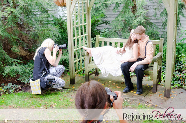
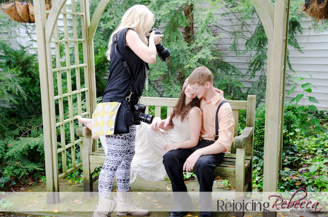
Seriously, Jean! Thanks for your invaluable insight. You were so helpful and I’m glad you drove in overnight to show us your tips!
Forever grateful,
This post is part of a series of posts I will write as I reflect on the iHeartFaces Photography Conference for women which I attended the first weekend of October, 2013. To see the all posts, click here.
Jennifer Tonetti-Spellman lead a talk about pricing, which has been the part of my business I struggle with most regularly. I had been looking forward to this talk since the conference schedule was released and I’m so glad I went.
First things first, Jennifer covered how to decide your package price. She says to add the hard cost of production, the amount of time you spend based on your hourly rate, and packing costs; then, she says to multiply by three. For example, if I sold a canvas that costs me $90, it took me 30 minutes @ $100/hour to prepare and deliver the canvas, and shipping cost me $15, that would be a total cost of $155; if I multiply that cost by three, I’d charge $465 for the canvas.
I found that information so useful. I’ve always wondered what my mark-up should be. In jewerly, the mark-up on gold is 3 times the cost of gold and sterling silver is four times. We call this “three-keystone” and “four-keystone” respectively. Sorry– just a quick flashback to my jewelry life from college summers.
Then, Jennifer transitioned to talking photography packages. This is where I started to realize that my shoot and share model is not really compatible with the shoot and print model of photographers. However, this information is invaluable for if I decide to move my business model to the direction that allows my clients to choose if they want to print with me or buy digitals only. Jennifer says to offer the products that you like, what is in demand, and what makes sense for your brand. I love how simply she put that and it totally makes sense. Since then, I’ve been scouring for unique ideas for my brides so that I can offer more interesting wedding packages; I’d love to shoot more weddings.
I’ve also wondered a lot about mini-sessions. Jennifer covered that, too. She suggested that we should only have mini-sessions offered a maximum of twice a year, for 20-minute sessions. She suggested that we offer 5-7 images and two print packages for simplicity sake. She also encouraged us to price these two packages close enough so that people will want to spring for the higher level package. A higher package may offer a few more proofs and maybe a few more prints if you’re a print photographer. Something in the higher package, though, needs to be interesting–like a large print.
Another print suggestion included highlighting discounts. For instance, offering a free mini-accordion if a client spends $500 on a print package, or a canvas if they spend $800.
One thing Jennifer encouraged us to do was to chunk our work days; she says she usually makes one day an editing day and one day a sales session day. For her sales sessions, she visits her clients in their home so she can help them decide what art to buy for their home; this way, she sees their walls, helps them measure and plan. Her clients do not see the final images until the sales session; she uses a iPad app to share their images with them.
There were so many other thoughts shared with us and so many details I’ve left off, I’m sure.
Overall Conclusions
Jennifer’s presentation was so very helpful. Oh, yeah, let’s talk about how passionate she is about photography and spending time with her family! We definitely shed a few tears about how our time is valuable and that our work time does take us away from our family, loved ones, and life in general. These points really encouraged us to value our work–editing time, product order time, etc.
Most of the photographers at the conference are print-based photographers, which isn’t my business model at all. So, much of what Jennifer had to say I have had to sort of move around in those file folders in my head so that it fits into my business model more. I wonder if printing would work for me if I were a full time photographer, but as a part-time photographer, I love shooting and sharing (seriously, there’s a blog post coming up about that; keep on the lookout!).
Jennifer, if you’re reading this, thank you so much for imparting your wisdom. Also, for taking time out to read this post! (Seriously, though, I hope you didn’t read it too closely… ;)) You’re genuine, you’re fun, and you love what you do. Intelligent? No, brilliant! I hope our paths cross in person again; otherwise, cyber-stalking will have to do.
Love,
This post is part of a series of posts I will write as I reflect on the iHeartFaces Photography Conference for women which I attended the first weekend of October, 2013. To see the all posts, click here.
Amandalynn Jones taught a class about posing women at the iHeartFaces Conference.
What was great about this class was having some hands-on practice. We had two live models to photograph. One model was full-figured and the other was of average size. I’m so pumped that Amandalynn gave us so many tips!
As I look back to this class, I think it has already been invaluable to my practice. (I mean, pretty dang soon you’ll see a post of a fabulous girl who I posed using information I learned at this class.)
First, Amandalynn taught us to always pose from the bottom up. When you move a subject’s feet or center of gravity, the rest of their body changes, too.
We learned foot positions for standing. Amandalynn covered the basic foot positions:

- Toes pointed at 10 and 2 or so.
- Bend one knee from 10 and 2 to pop the hip a little bit.
- Cross the calves/ankles with one foot in front of the foot all the weight is resting on.
- Cross the calves/ankles with one foot behind the foot all the weight is resting on.
- Rest the weight on one leg and spread the stance just beyond shoulder width apart; this makes the legs straight, which may not be desired.
- One foot pointed at the toe beside the other foot. At this position, the heel can be turned to give a different feel depending on the look desired.
We also talked about forced perspective as important for creating a flattering pose. As most of us already practice, shooting down on a subject makes the eyes open more. On top of that, if a women leans forward a bit, the head is much closer to the lens than the rest of the body; this makes the body appear smaller, flattering the subject.
What I had never thought about was what Amandalynn called “club” hands. This is where a hand disappears behind another subject’s arms or something, leaving only the arm. This gives the appearance that the subject doesn’t have a hand. Amandalynn showed us ways to be sure that hands are shown, relaxed, and not awkwardly placed.
One thing I’ve already used during at least two shoots is the method to relax stressed hands. If subjects touch their thumb to their middle finger and then release, their hands will relax. Magic!
I love putting my subjects in front of an interesting door or other backdrop; often, I have them lean on the surface. If I have a subject leaning on one shoulder, Amandalynn taught us that we can have the subject roll a little forward on the shoulder, which will pull some of the upper arm fat back, giving the appearance of a smaller arm–very flattering to a subject.
Also, having the subject rest their bottom on the vertical surface and lean forward will allow for the forced perspective which makes a body look smaller.
So far, these are the lessons I recall most. I can’t wait to really practice and master these skills.
Thanks so much, Amandalynn, for sharing your expertise! You packed SO MUCH into just a short amount of time.
Love forever,
